
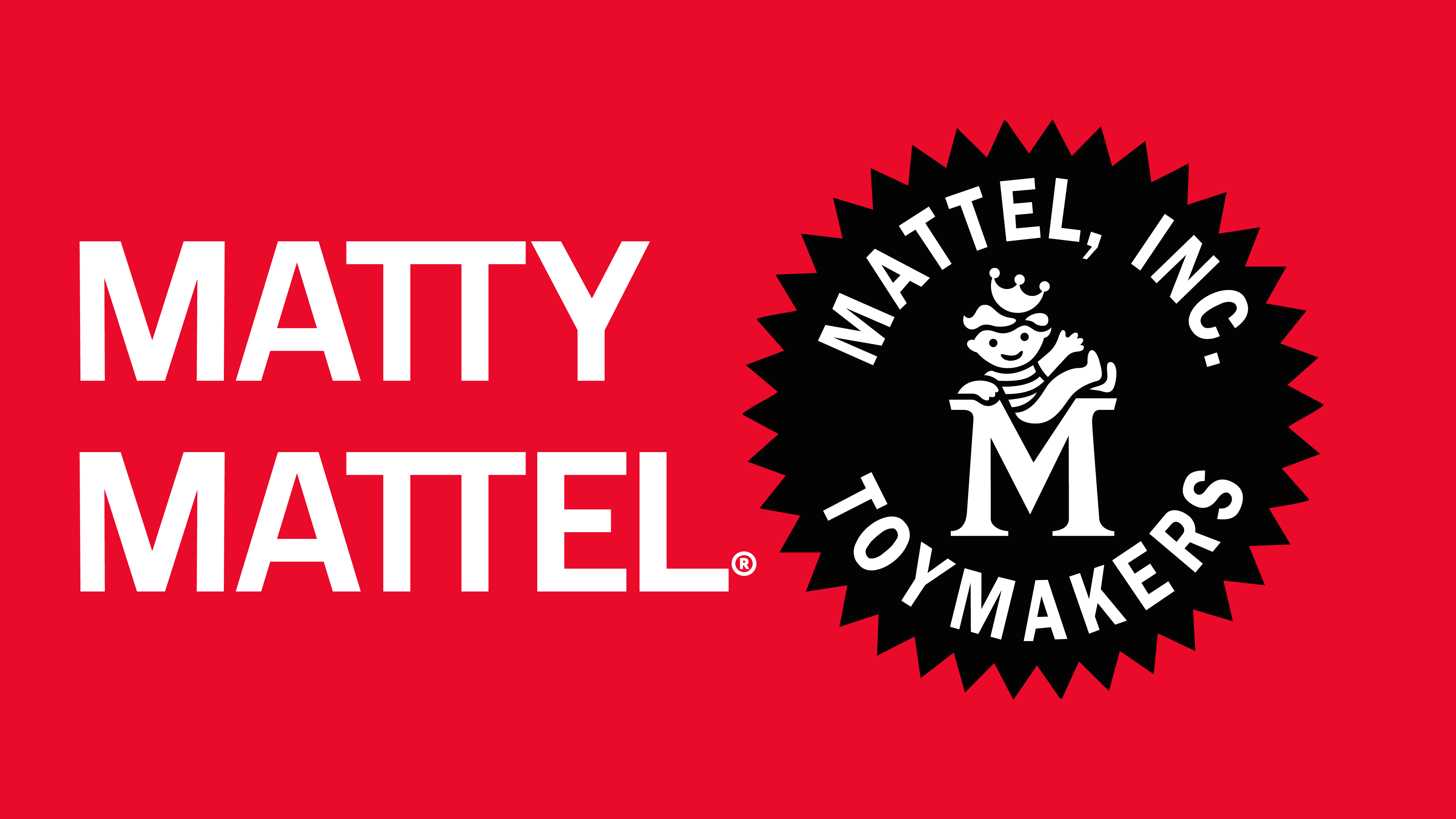
A Custom Typeface for Mattel's Toy Universe: MATTY & BELLE MATTEL
As one of the most recognizable names in global entertainment and toys, Mattel operates across an enormous range of brands, platforms, and audiences. In support of a broader brand system, Mattel worked with Chicago-based agency GERTRUDE, INC. to develop a typographic voice that could bring consistency and character to its visual language.
As part of that effort, Gertrude partnered with Avondale Type Co. to design a custom typeface created specifically for Mattel’s needs — a bespoke font system intended to work across packaging, digital products, marketing, and storytelling.
Designing a Bespoke Typeface for a Global Brand
The resulting type family was designed to balance approachability with clarity, reflecting Mattel’s playful heritage while remaining flexible enough for contemporary brand use. Built as a proprietary Mattel typeface, the system includes a primary sans serif designed for broad application, alongside a set of complementary characters and graphic elements that allow for more expressive moments.From the outset, the goal was not to impose a singular stylistic gesture, but to create a typographic foundation that could adapt across Mattel’s many sub-brands and future initiatives. The custom typeface was developed to function at a wide range of sizes and contexts, from large-scale branding to detailed product communication.
Collaboration Between Agency and Type Designer
The project was shaped through close collaboration with Gertrude’s creative and strategic teams, who led the overall brand work and commissioned Avondale Type Co. to design the bespoke font. This process ensured that the typeface aligned with broader brand principles while remaining practical for real-world use across teams and markets.Rather than relying on an existing font, the decision to pursue a custom typeface allowed for greater control over tone, functionality, and long-term consistency — qualities that are especially important for a brand operating at Mattel’s scale.
Press
Jan 26
PRINT A Typeface for a Toy Universe: MATTY & BELLE MATTEL® by GERTRUDE